

Business, UX/UI
5 Ways to Prototype Your Digital Product Idea: An Exploration Beyond the Obvious
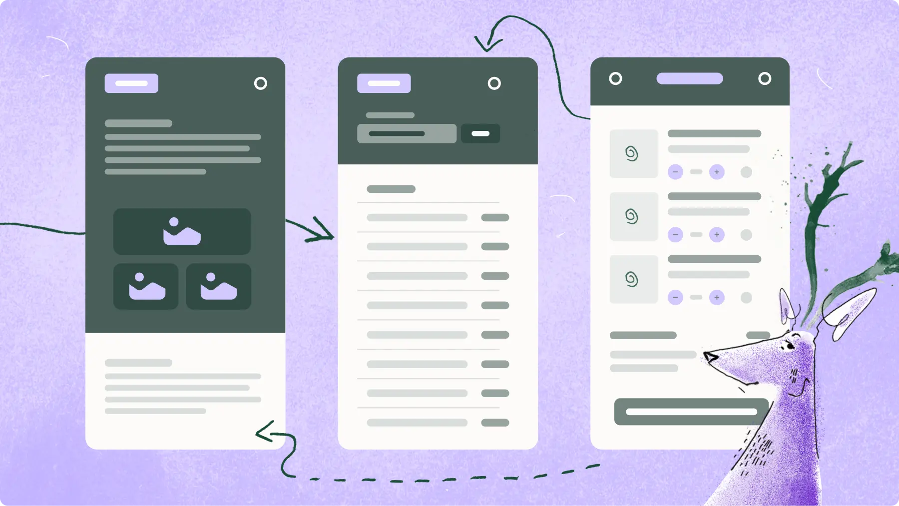
Behind every groundbreaking product lies a story of trial, error, and refinement. This story begins with a process as old as innovation itself – prototyping. Not without reason, voices from all corners of the ever-evolving tech world repeat a common mantra: "Prototype before you produce”. Well... we couldn’t agree more. Prototyping is essential — it helps visualize, test, and refine your ideas before diving into full-scale production. In fact, prototyping is the foundation of any new product - whether it's an airplane, a car, or a kid's toy, so why do we want to skip this step for digital products?
However, today's focus isn't on why prototyping is crucial.
Let's delve into what a prototype can be.👇
When you think of an app prototype, what comes to mind?
A test version of your idea? A simulation? Something imperfect, like rough sketches? Or perhaps a detailed graphic design or an illustrative video presenting your idea? The truth is, a prototype can be all these things and much more. In this article, we'll explore the diverse forms prototypes can take, all without writing a single line of code. Let's bet you'll find some of them surprisingly innovative!
1. Interactive Paper Sketches 📝 ✂️
Imagine starting with nothing but paper and pencil – rudimentary yet highly effective! Hand-drawn prototypes are the most cost and time-efficient way to validate your idea. While it’s not the final product you'll bring to market, it's a fantastic way to test your initial concept at least with friends and family. And don’t think it’s too simple or limited, you can simulate interaction and test accurate app flow - even if you can’t draw!
Don't believe that it's worth testing on sketches?
I tell you my story. My first-ever prototype was a mobile app for food ordering, crafted entirely on paper. Using printed phone templates, I sketched different screens and arranged them in a stack reflecting the app flow. Watching my colleagues interact with these sketches, tapping on paper buttons, was not just amusing but incredibly insightful. It didn't matter that these were just pieces of paper; everyone focused on the product, sharing valuable feedback.
Where did it get me?
I was able to test how users search for food, and whether the ordering flow is convenient for them
I discovered what factors they take into account when choosing a restaurant. To my surprise, delivery time and cost were one of the most important pieces of information
I found out that food photos are treated critically (even though the prototype showed only grey squares), and many people assume that "the food doesn't actually look like that anyway"
By showing them screens with a list of filters and food categories, I checked which options they chose most often and which ones were missing
In just one day, I sketched and tested the concept, verifying many assumptions and discovering new features. It was a vivid reminder that innovation doesn't always require high-tech solutions; sometimes, a simple sketch can speak volumes! ✨
Interactive paper prototype by Bonnie Jiang
Getting Started:
Even if you're not artistically inclined, paper prototyping is accessible to all. Simple shapes, lines, and text are all you need to draw. Start by sketching your idea, however basic, and see where it leads you. After that, ask people to navigate the app, complete some core tasks, and share their thoughts. Don't worry that you can't draw, no one will be offended if the line is crooked. Of course, you can reach for the ruler and make it perfect, but it's still a sketchy prototype, so consider whether it's worth it ;)
👉 For helpful sketch sheets, visit: https://www.sketchize.com/
✏️ If you need more help with drawing elements you can reach for interface stencils
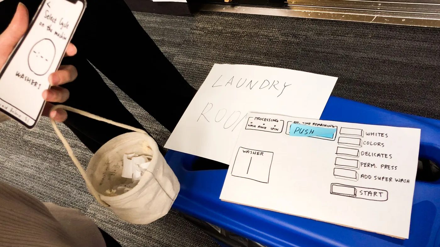
Paper prototype for laundry app by students in the MHCI+D program
🗓️ When to use:
Ideal for validating any initial idea or new feature. Useful in early-stage startups or educational settings where resources are limited.
Great for quickly validating basic user flow or interface layout ideas with team members or early testers.
For brainstorming sessions when you're exploring various conceptual directions or need to rapidly iterate design ideas.
To speed up endless meetings where you argue how the interface should work ;)
✅ Pros:
There is no emotional attachment, it's easy to throw away the entire prototype
People feel more comfortable criticizing sketches rather than polished designs
Gather early users’ feedback, before committing to the actual design
Highly cost-effective and quick to produce
Creating multiple versions of a design takes minutes
❌ Cons:
Not suitable for complex interactions
Limited in scope and functionality
Participants may struggle to interpret the design, it requires imagination
Not suitable for detailed feedback on actual experiences
Testing it with a wide range of unknown recipients may feel less comfortable
2. Data-driven prototypes in Excel 📊
Have you heard stories about projects with fancy dashboards and illustrations, that required large investment and development work, yet didn't stand the test of time? Although beautiful, no one wanted to use them.
Or maybe your idea isn't simple, but methodologically complex, and you're worried that people won't understand your final product so you’ll spend money in vain?
Instead of jumping into building a complex system, translating your methodology into Excel can be a wise first step. Excel can be a surprising yet effective tool for prototyping, especially for methodologies involving forms, tables, and data visualization.
Purple Deer Experience:
Organizing and analyzing methodologies on designs or even grey wireframes may distract us from focusing on the real issue. That's why we conducted our latest user research entirely on a prototype in Excel! In our quest for efficiency and swift user feedback, we used Excel to rapidly test product methodology and terminology. Since the solution was based on data, we created appropriate forms in Excel and invited users to work with it. Nice bonus - our users, already fluent in Excel, could focus intently on the content, free from the distraction of navigating a new tool. How did it help us?
We checked how users understood terminology and vocabulary, discovering industry abbreviations and concepts that were not understandable by users, as it might seem
We explored users' natural workflows and thought processes, which allowed us to reorder fields and determine a more intuitive sequence.
We observed users' need for sharing or delegating some questions to team members, which emphasized the importance of the multi-user collaboration feature.
The research highlighted also the need to shift from many predefined choices to a more flexible, open-ended selection, empowering users to input custom data.
Plus we gained real, actionable data and identified previously overlooked scenarios, which allowed us to adapt the solution to different processes and institutions.
All without the need to design or develop expensive solutions!
And what's most interesting - it turned out that for some people Excel was such a useful solution that they could use it immediately. 🤯 The methodology can already be sold as a service while still being refined before evolving into the final software product.
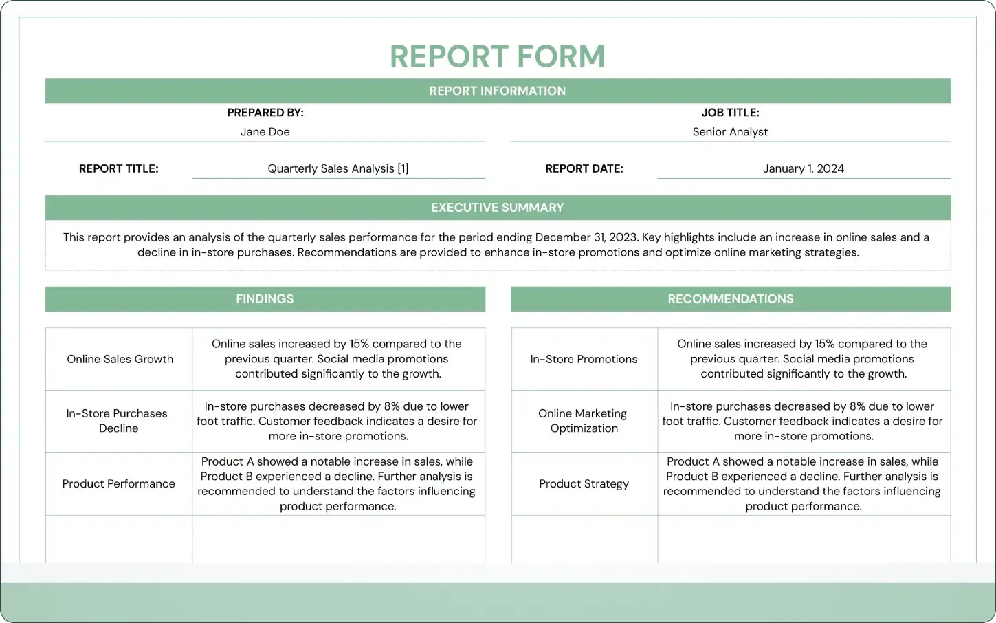
Excel report form by Template.net
But Excel's versatility extends far beyond dashboards and charts. It can visualize a wide range of data-driven concepts, from complex forms, through fitness calculators to budget planners. Here are a few compelling examples demonstrating Excel's adaptability in action:
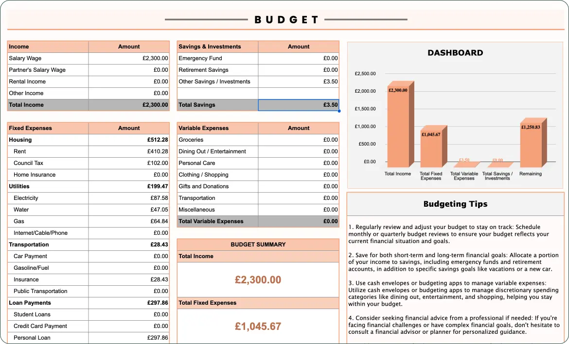
Excel budget tracker by Template.net
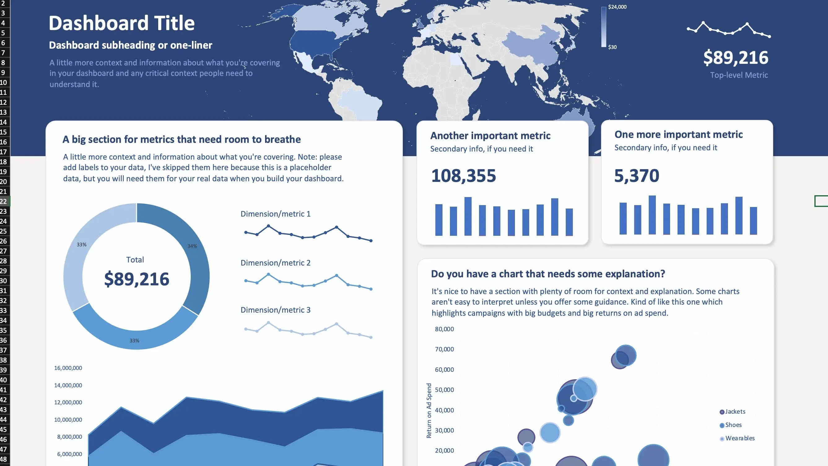
Advanced Excel dashboard by ExcelDashboardTemplate (In fact, if you create such a dashboard in Excel, you probably don't need any other software)
🗓️ When to use:
It’s an excellent starting point before venturing into more complex ‘data-driven’ solutions.
When you need to present or validate the functionality of data-driven features, such as dynamic charts or tables, without the need for a fully developed software solution.
Best for projects that heavily rely on data manipulation, such as financial apps, data analytics tools, or budget planners.
When you want to test how users work with your new methodology of operation or organization of work.
Ideal for validating backend logic, such as calculations or data processing methods, before integrating them into a more complex system.
Useful in environments where Excel is a familiar tool, making it easier to get feedback from stakeholders who are comfortable with it.
✅ Pros:
Accessible and versatile
Perfect for prototyping forms, tables, and data visualization
Can be released as an early version for clients instead of a one-time test
User-friendly for Excel-savvy individuals
Provides import/export mechanisms and the ability to easily store or change data
Easy sharing and making ongoing changes
❌ Cons:
Limited scalability and automation
May become slow and unresponsive with large amounts of data
Requires good knowledge of Excel to build a complex structure
It is not suitable for testing user experiences or interactions because it does not reflect the actual product interface
3. Content validation with Notion 🗒️
If your product consisted mainly of content and knowledge that you planned to share with users, how would you quickly validate it with the market? We're all familiar with tools like Google Docs and Forms, but there's another less popular platform - Notion. Basically, it is a tool for taking notes, but we have an idea for additional uses!
Let’s imagine you’re planning to build a platform with courses, templates, and self-assessment tools. What do you need? Add text, nice graphics and upload videos? You can do this in Notion. Need categorizing, sorting, or filtering? Still possible. Search option? It’s there. Complex table and database management also. And these are just some of the features. So in our deer opinion (and as you’ll see below, not only ours), in many cases, it can be a nice tool for testing application concepts and even selling materials. What we can ensure is that it’ll be much faster and cheaper for you to rework and shuffle the content here rather than in custom-built software.
Another smart idea is to prototype and test on Notion your landing page, or more precisely, the content you intend to put on it. Why use Notion rather than other tools defined to build websites? Just to focus on the content and test the message, not the final layout and interactions. We all have the temptation to spend too much time making a landing page pretty before we test if the message resonates with our target users. Words are still the most powerful tool on the web.
Check example templates created on Notion:
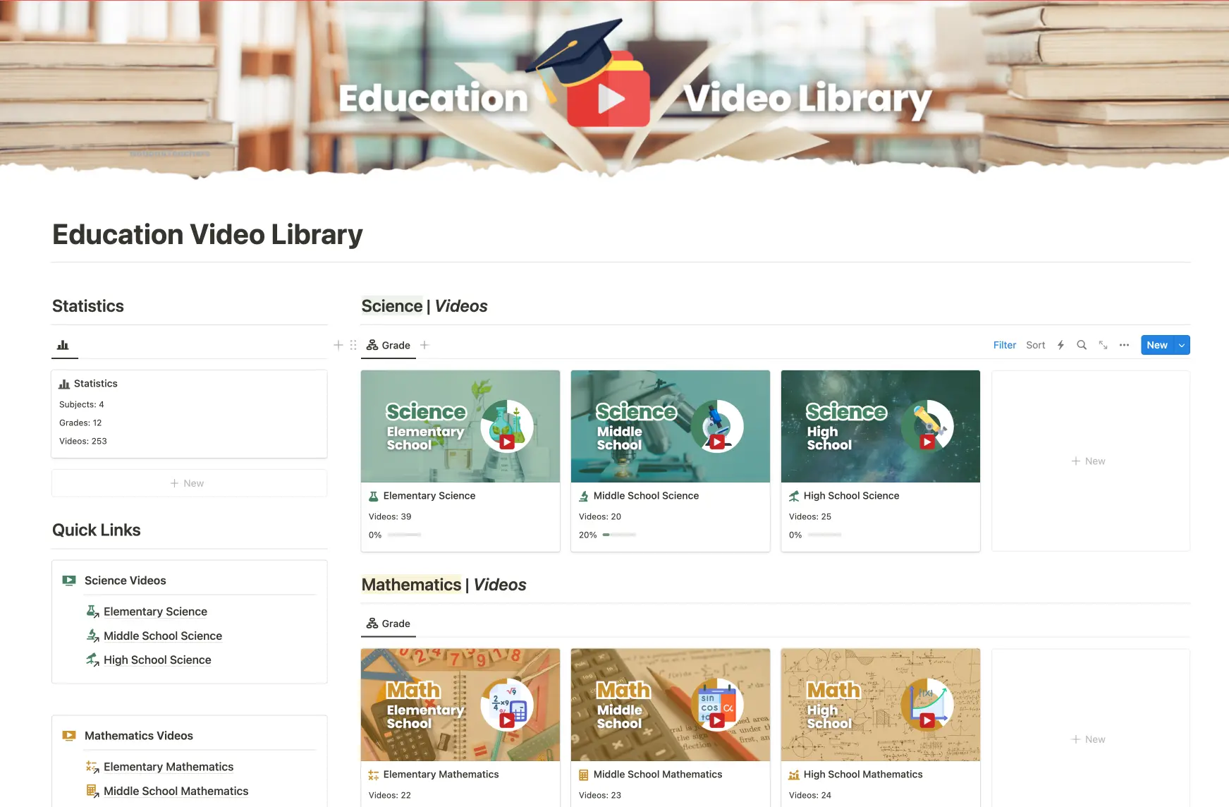
Education Video Library by NotionForTeachers
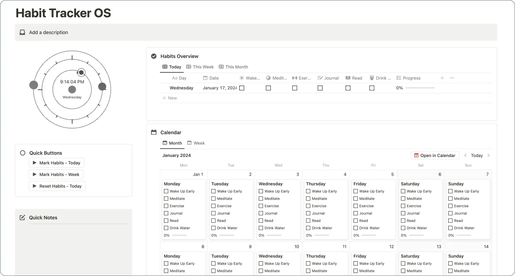
Habitat Tracker template by iamsourabhshen
However, for certain concepts, Notion might be an unnecessary complication. If your project is centred around creating a quiz or involves numerous questionnaires, consider using more straightforward tools like Typeform or Survey Monkey. These platforms are specifically designed for crafting and refining question sets, so you can quickly build what you need.
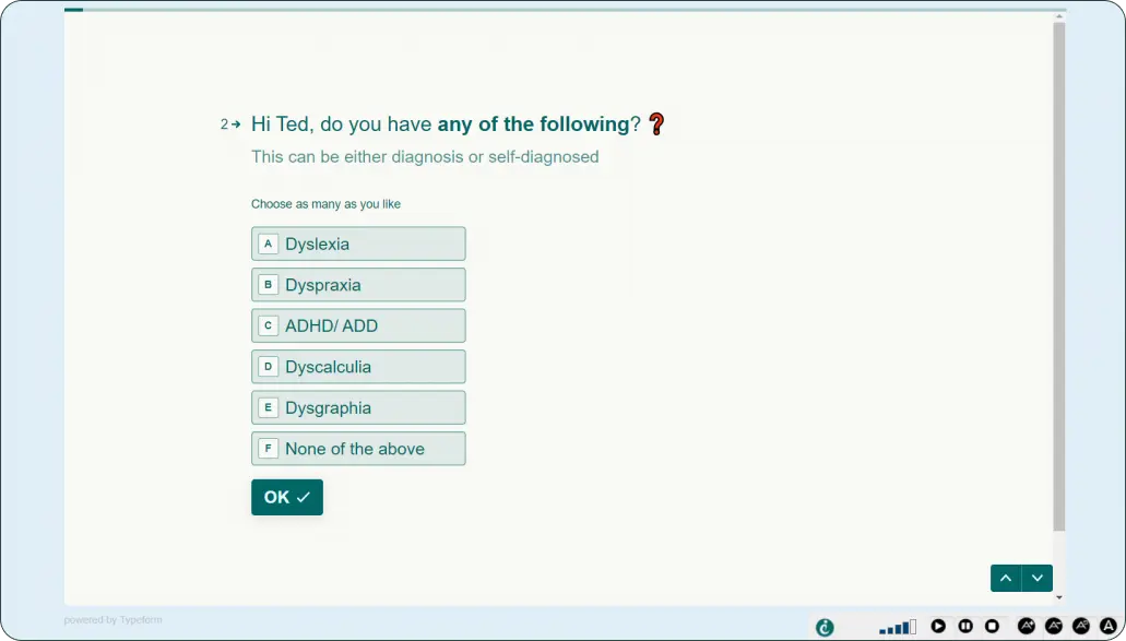
Typeform survey by Clickydrip
🗓️ When to use:
Perfect for content-focused platforms, such as educational resources, knowledge bases, or community hubs
Ideal for testing the organization of large amounts of information, including databases, categorization systems, and content hierarchies
Useful for entrepreneurs and startups to measure the interest and reception of content-based services
To quickly set up and test the structure and content of the landing page
✅ Pros:
Versatile and easy to modify
Wide range of built-in functions and templates
Supports various content formats
Option to embed external content such as Google Maps, YouTube, Typeform
Approachable for non-tech persons
❌ Cons:
Requires at least basic knowledge of the Notion
Limited to Notion’s options, no possibility to add custom interactions
May not fully represent the final product's complexity
Limited in terms of brand design
*If you don’t know Notion yet, and don’t organise your work, documents, and all life in there, give it a try. This tool stole our hearts last year ;)
4. Interactive Graphic Designs 🖼️
That might be something you know. Clickable prototypes, made of interconnected designed screens. This is where your idea transforms from a sketch into a more tangible, interactive experience. Usually made in advanced tools like Framer or Figma, but a simple one can be made even in PowerPoint.
Such a prototype will work when your idea is already more developed and can be translated into an interface. It gives you the opportunity to test the functionality, check how users understand and navigate the application, and what the overall user experience is like.
"Prototyping is a quick way to go from sketches or wireframes to a simulation where you can get user feedback”
~ Tom Lowry, Director of Advocacy at Figma.
However, they’re more time-consuming. And, of course, the larger the application and the flow, the more complex it becomes.
You can start with low-fidelity black-and-white mockups, or take photos of your sketches and link them in a flow. For a more detailed and realistic view, you can go towards high-fidelity prototypes which take you as close as possible to a true representation of the user interface.
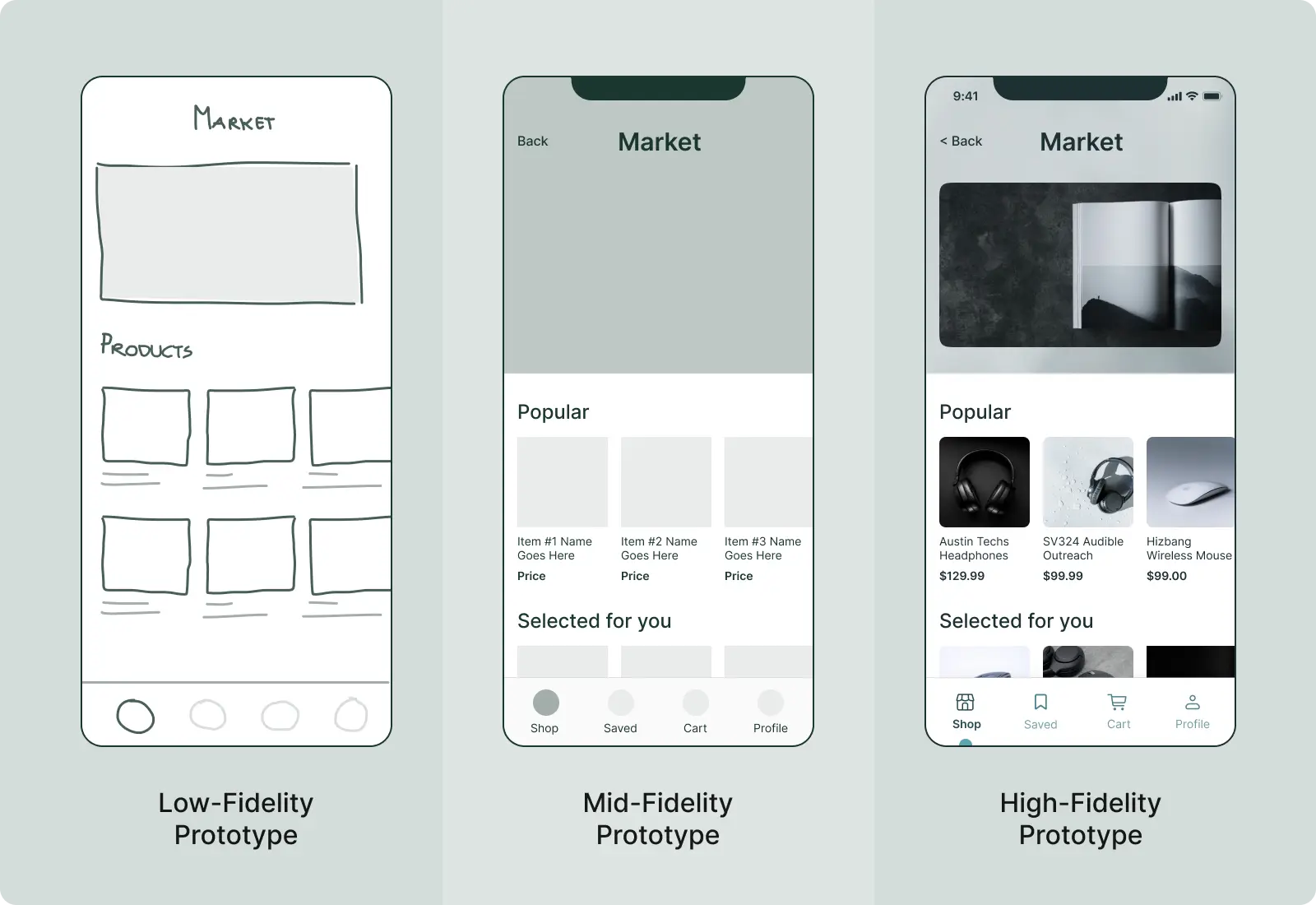
Platforms like Framer or Figma allow the creation of prototypes that closely resemble a fully coded app, by simulating transitions, animations, data entry, and more. You can go through such a prototype almost exactly like you go through the final product.
🗓️ When to use:
Suitable for more advanced stages of product development where the visual design and user experience begin to take shape and can be translated into an interface.
Ideal for testing the functionality, usability, and intuitiveness of the interface.
Great for presenting to stakeholders or investors to give them a tangible sense of how the final product will look and function.
✅ Pros:
Allows realistic user interaction testing
Excellent for user testing and validating functionalities with developers.
You can start with low-fidelity black-and-white mockups and gradually increase the detail in subsequent versions
❌ Cons:
May be mistaken for the final product
More time-consuming, complexity increases with the scale of the app and the level of detail.
Required knowledge of advanced prototyping programs
5. Recorded Videos 🎥
Video prototypes are not just a tool for visualization; they're a powerful medium for storytelling and conveying the essence of your product. They allow you to imagine what it would be like to use a certain product, bringing the concept to life. Such videos serve multiple purposes: they can introduce your concept to the world, captivate potential customers, stakeholders, and investors, and provide insights into the product’s functionality and potential gaps.
Take Dropbox's origin story as an example. Drew Houston, founder of Dropbox, built an early prototype to address the file sync problem. Although not ready for a public launch, he recorded a video demonstrating its main features. This video, released on Hacker News in 2007, reached about 2 million people and resulted in 70,000 new sign-ups for the beta version. That proves that a well-made explainer video can effectively sell a concept and generate user interest.
Check the Dropbox Original MVP Video
How to prepare such a video? You can use your existing prototypes as a foundation. At a more developed stage, you can record your screen while navigating through your mockups, showing the app’s functionality in real time. Don’t have anything tangible yet? Record yourself explaining the idea and demonstrating core actions, and then you can add to the video the missing elements, photos, and titles.
Tip: A video prototype doesn’t have to be perfect and the most beautiful, it’s not the product promo but a demonstration and exploration of your potential solution. Keep the video short and focus on the value your product offers.
🗓️ When to use:
Useful for specifying user interfaces for technologies that do not yet exist and can simulate the mechanics of real systems without actually having to build them.
When you don’t have something ready to share with the market but want to measure interest and gather early-access users.
Beneficial for remote teams or audiences where a live demonstration isn’t feasible, allowing for a visual and dynamic representation of the product idea.
For complex solutions, when your product needs additional explanation.
Effective for pitching and presenting concepts to potential investors or stakeholders when the product is still in the conceptual phase
✅ Pros:
Showing the context of the use
Building video helps you spot missing parts of your product's flow
Easy to engage with a wider audience and share on social media
Grab a viewer’s attention to keep them interested for longer than text or static images
Excellent for concept selling and investor pitches
❌ Cons:
Can't physically interact with the product
The risk that the concept may drift away from feasible implementation
Can’t test usability
The risk that the video can mislead people into believing that the prototype is the finished product
Final thoughts
As we close this explorative journey through the diverse landscape of prototyping, let's revisit the core mantra: "Prototype before you produce”. Whether it's the initial validation of an idea with paper sketches, organizing data in Excel, or crafting an engaging narrative through video, every prototype method is a step forward in refining your digital product.
Don’t fear presenting something unfinished to your potential users. A prototype, much like a journey through an uncharted forest, is an experiment. It's a blend of diverse elements, a search for the ideal composition, and a crucial test to ensure your final product truly resonates with your audience.
Key takeaways:
Getting feedback on a prototype is one of the easiest and cheapest ways to get feedback before you spend a lot of money building something that might not meet user needs.
It is not practical to invest too much in a good design for the prototype since it may need to be reworked several times.
A prototype doesn’t have to resemble the final or intended solution. It helps us gain a deeper understanding of the problem and answers our research questions. It’s a tool for learning, not just for delivering ;)
A prototype can be anything from paper drawings, through Excel visualizations, to interactive mockups. It’s not the fidelity that matters but the clarity and insights it brings to your project.
The more time you take to create the prototype, the less willing you are to throw it away or make changes to it.
If you’ve spent more time tweaking & perfecting your prototype than actually testing it, something’s wrong.
Convinced that one of the prototypes above is for you? Before you jump into making visualizations, read our advice on how to prepare for idea validation: From Idea to Prototype: Essential Early Steps for Aspiring Founder.
🦌 Need help crafting your prototype? That’s our speciality at Purple Deer. Reach out, and let’s transform your vision into a prototype that paves the way to success!
Paper prototyping: https://uxplanet.org/the-magic-of-paper-prototyping-51693eac6bc3
Dropbox video story: https://www.indusnet.co.in/explainer-video-helped-dropbox-grow-0-100-million-users/


