

Intro
One day at the end of 2022, Alex Landowski returned with another challenge for us to tackle together. This time, he aimed to introduce a unique addition to his portfolio: Medical Laboratories. He envisioned it as a standout in its field, distinguished by its quality while remaining accessible not just to the wealthiest clients.
Hearing about the mission behind Medical Laboratories resonated deeply with us. The goal was to establish a facility where clients could access medical services of high quality at reasonable prices. It was about becoming a quality-driven partner that clients could depend on.
The Challenge
Our first step was diving into workshops. These sessions were more than just meetings; they were our pathway to truly grasp the vision behind Medical Laboratories and how it should connect with its audience.
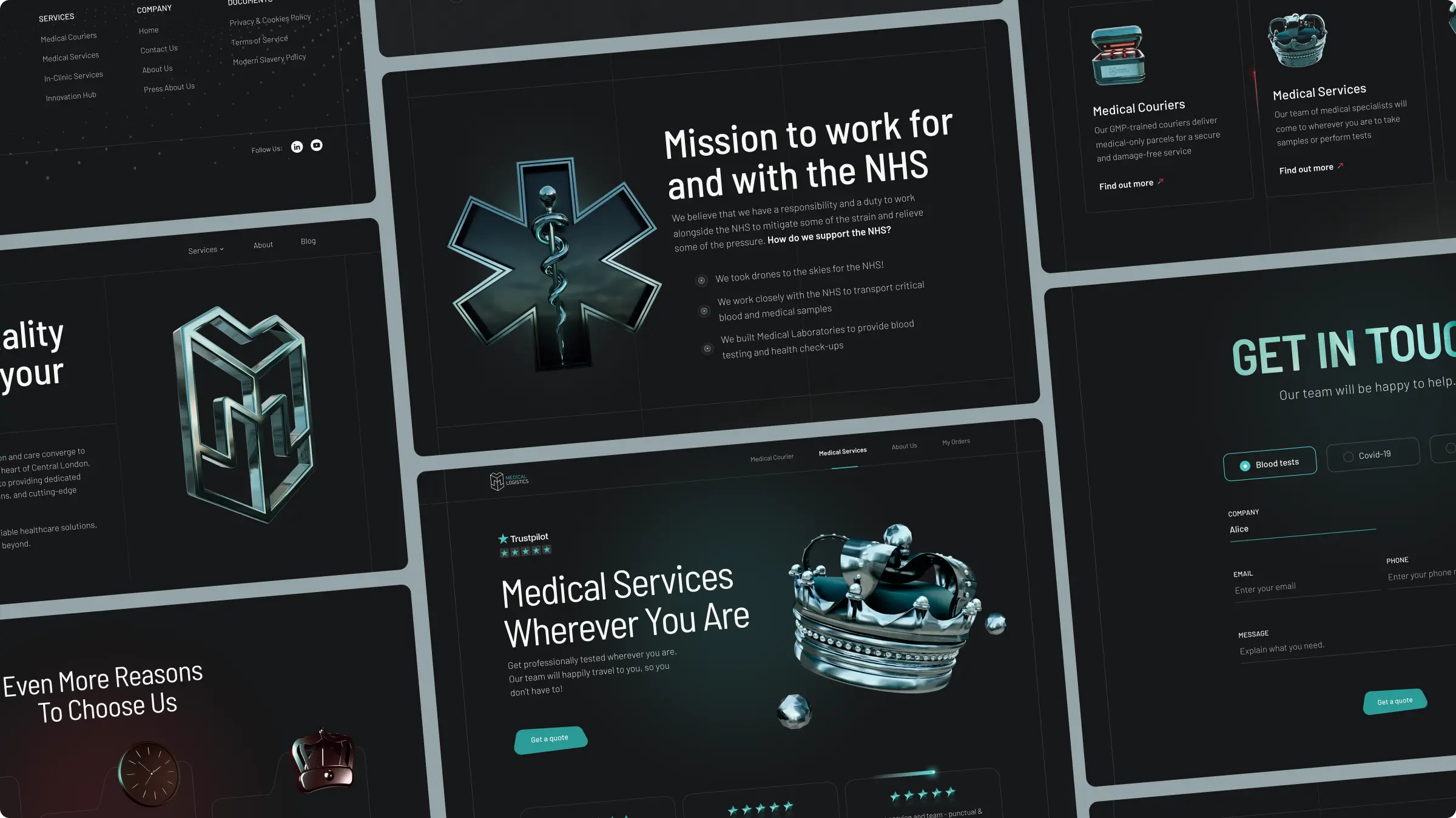
We started with discussions around the existing branding of Medical Logistics, since it was envisioned as a sister brand. The goal was to weave both brands into a cohesive narrative, while ensuring they remained distinct entities.
A memorable part of our adventure was when we encouraged Alex to envision his brand as a vehicle. This exercise wasn't just a playful diversion—it was a strategic move to shift our thinking. Imagining Medical Laboratories as a vehicle allowed us to tap into a well of creativity, steering us away from the usual and towards a brand identity that truly stood out.
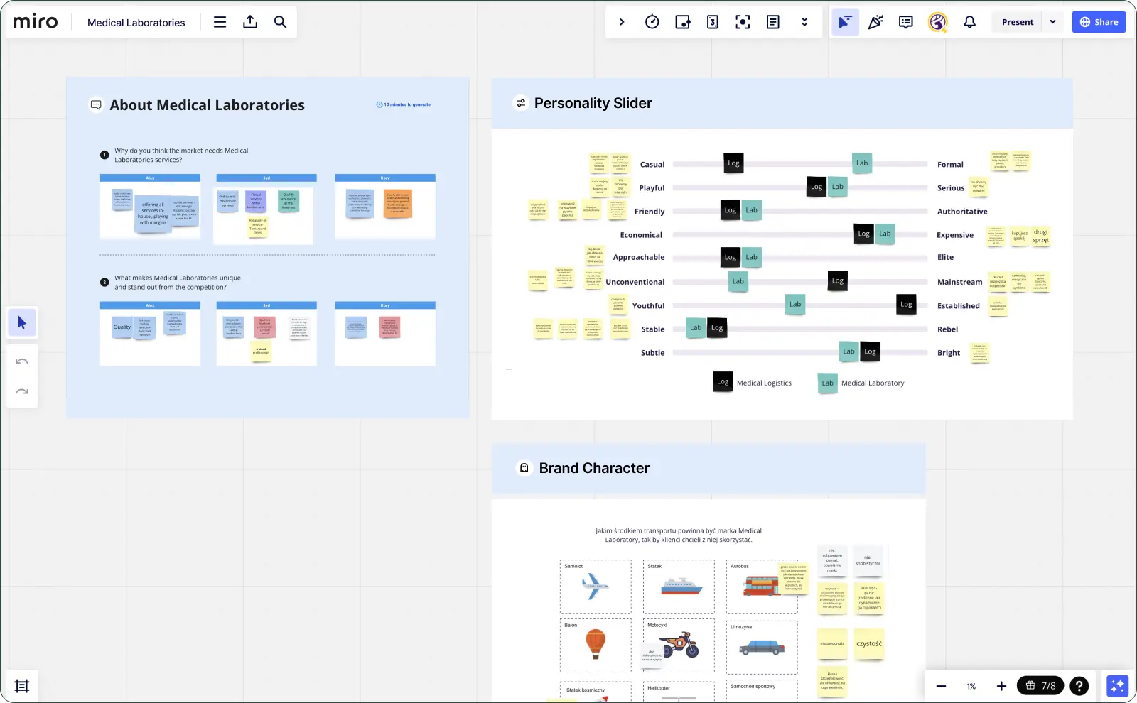
Finding Brand Personality
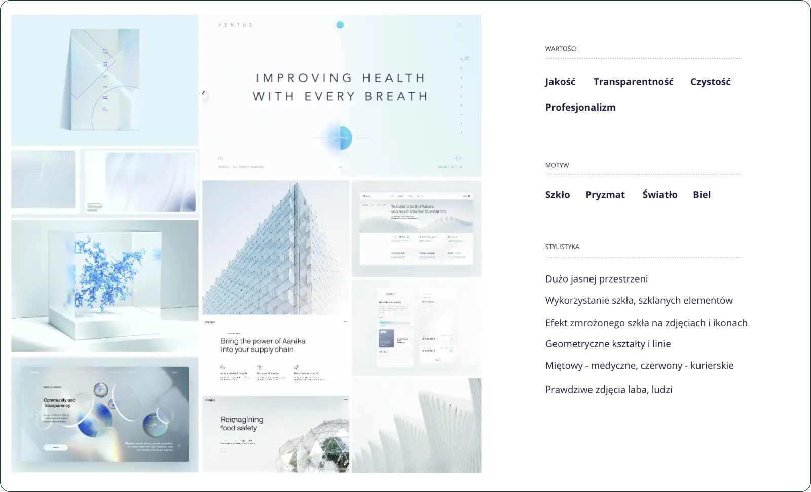
Creating a moodboard is a key step in our process, coming after we've gathered lots of insights. Think of it as using a map in a forest trek with the deer, helping us and our client pick the right path for the brand. This part is all about the vibe, telling a story, and picking a look. It makes sure our client can see, not just hear, what their brand is all about.
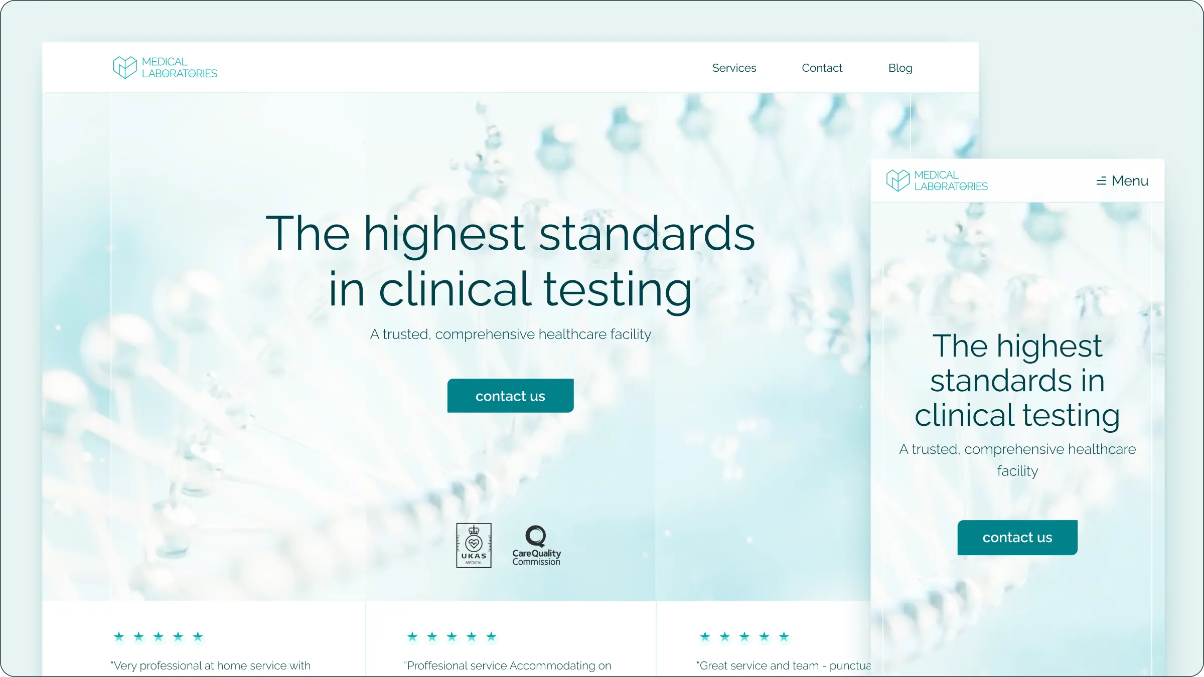
The brand was to mirror values of transparency, professionalism, and the highest quality of services offered. Imagine glass reflecting clarity and transparency, with bright colors, whites, and an abundance of light accentuating purity and quality. A touch of mint green serves as a medical association and a nod to the sister brand, blending familiarity with freshness.
Navigating this path also presented a risk - the challenge of not crafting an image that felt too aloof or impersonal. The goal was to strike a delicate balance, creating a brand image that was both aspirational and accessible, inviting clients into a world where professionalism meets human touch, illuminated by the guiding light of clarity and quality.
Logo Building
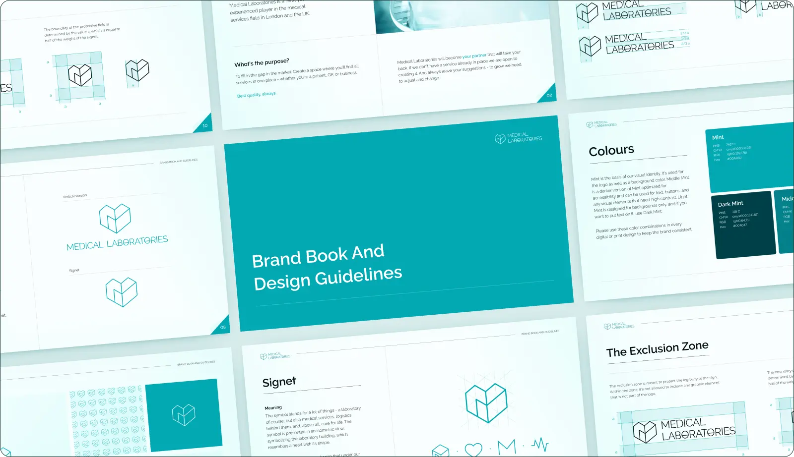
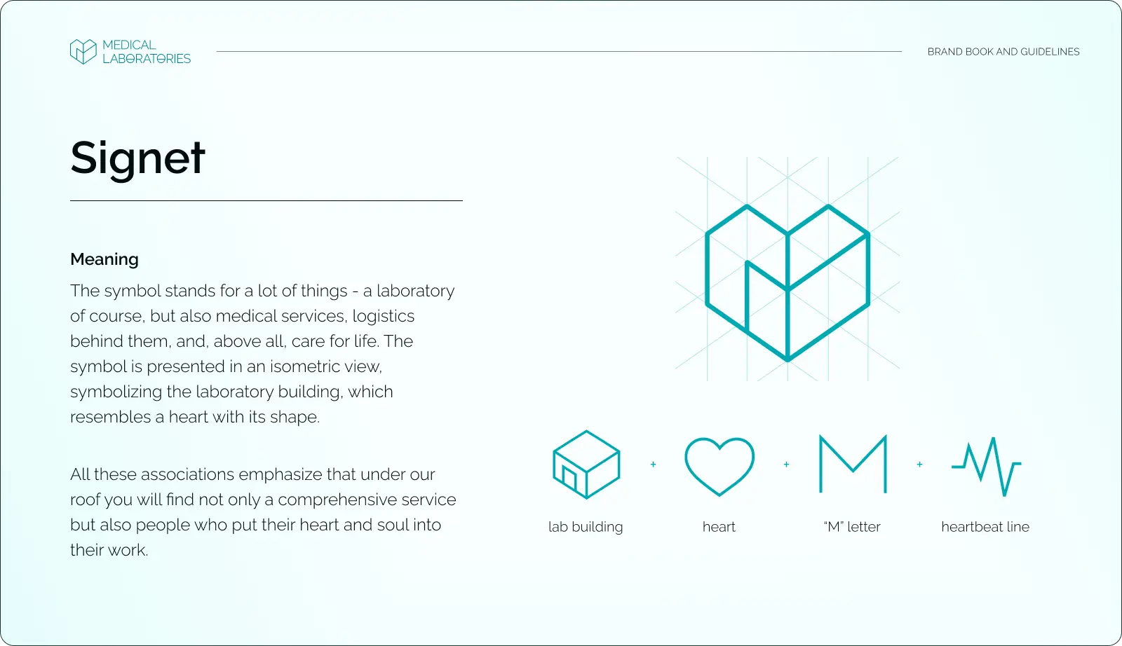
Designing the logo for the new company posed a unique challenge: it needed to simultaneously echo the logo of Medical Logistics while establishing a distinct identity for a completely different entity.
Moreover, the logo was required to be versatile in its application, not just a symbol for the website, but adaptable for use on signage, laboratory walls, flyers, and all corporate materials. This demanded a design that was not only recognizable but also functional across various mediums.
Our journey to find that unique symbol involved extensive exploration and experimentation with different variations. It was an internal step, brimming with creativity and a plethora of ideas, from which we would select the 2-3 best versions to present to Alex.
This process was not just about finding a design that looked good; it was about uncovering a symbol that encapsulated the essence of the brand and could stand the test of varied applications, ensuring the logo would become an integral part of the brand's identity across all platforms.
A logo isn't just a pretty emblem; it's a symbol that carries meaning and connection. For Medical Laboratories, the design not only nods to its sister company, Medical Logistics, but also incorporates other significant attributes relevant to its identity. These include elements like a building, a lifeline, a heart, and the letter M, each chosen to reflect the core values and services of Medical Laboratories.
Final result
By the end of our journey, Alex and we didn't just develop a brand identity; we uncovered the soul of Medical Laboratories. This process was more than a task; it was a shared creative expedition that brought Alex's vision for his business to life.
If you, too, wish to build a brand identity for your mark and the idea you believe in. Reach out via email or schedule a meeting with us. Let's set off on this journey together!