

Project Background
As we navigate through the business journey, not every website stands the test of time, and even more crucially, the test of business evolution. This happened to Alex Landowski and Medical Logistics. He had a well-crafted website, a creation of his own hands from years past. But since then, much has changed for Medical Logistics and for him.
Medical Logistics was no longer a small, startup-vibe, one-man band. It had transformed into a stable and growing company, sheltering several services under one roof. And their digital presence, starting with the website, needed to be realigned with their evolved landscape.
The Story
Alex Landowski, founder of Medical Logistics, a leading healthcare solutions provider in the UK, sought to enhance the online presence of his company and transform its obsolete website. The goal was to establish a modern, innovative, and professional image while differentiating offered services for specific audiences.
The primary challenge was to create a cohesive yet distinct identity for two services - medical couriers and mobile healthcare services. They needed to be visually separate to cater to diverse audiences, yet interconnected to showcase the synergy of Medical Logistics services.
Great attention to detail and understanding of the complicated process involving a non-techy person explaining his vision (it's me)
~Alex Landowski
We adopted a holistic strategy that went beyond aesthetically pleasing visuals. We conducted an in-depth business analysis, focusing on understanding Medical Logistics' core services and market positioning. In addition to visually appealing elements, our design process incorporated realistic 3D elements to set the company apart from the competition.
Guiding the entire project was a compelling motto provided by Alex at the outset:
This directive was the beacon that illuminated every aspect of the project, ensuring that every element, from design to content, was crafted to leave a lasting impression on every visitor, whether they were potential investors, partners, or direct clients. The goal was to etch Medical Logistics into the memory of all who navigated through the site, invoking strong emotions and a memorable brand experience.
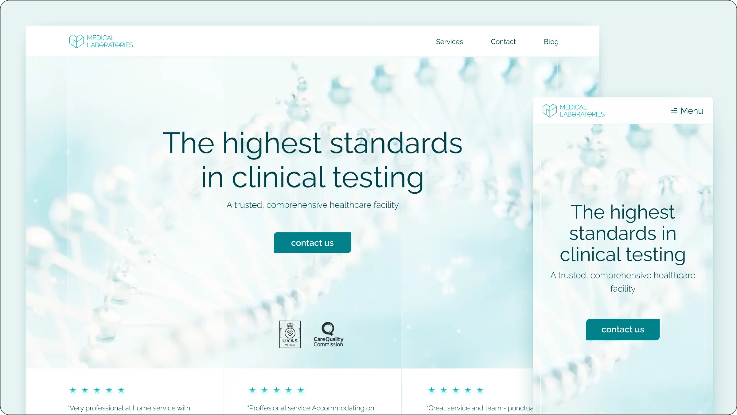
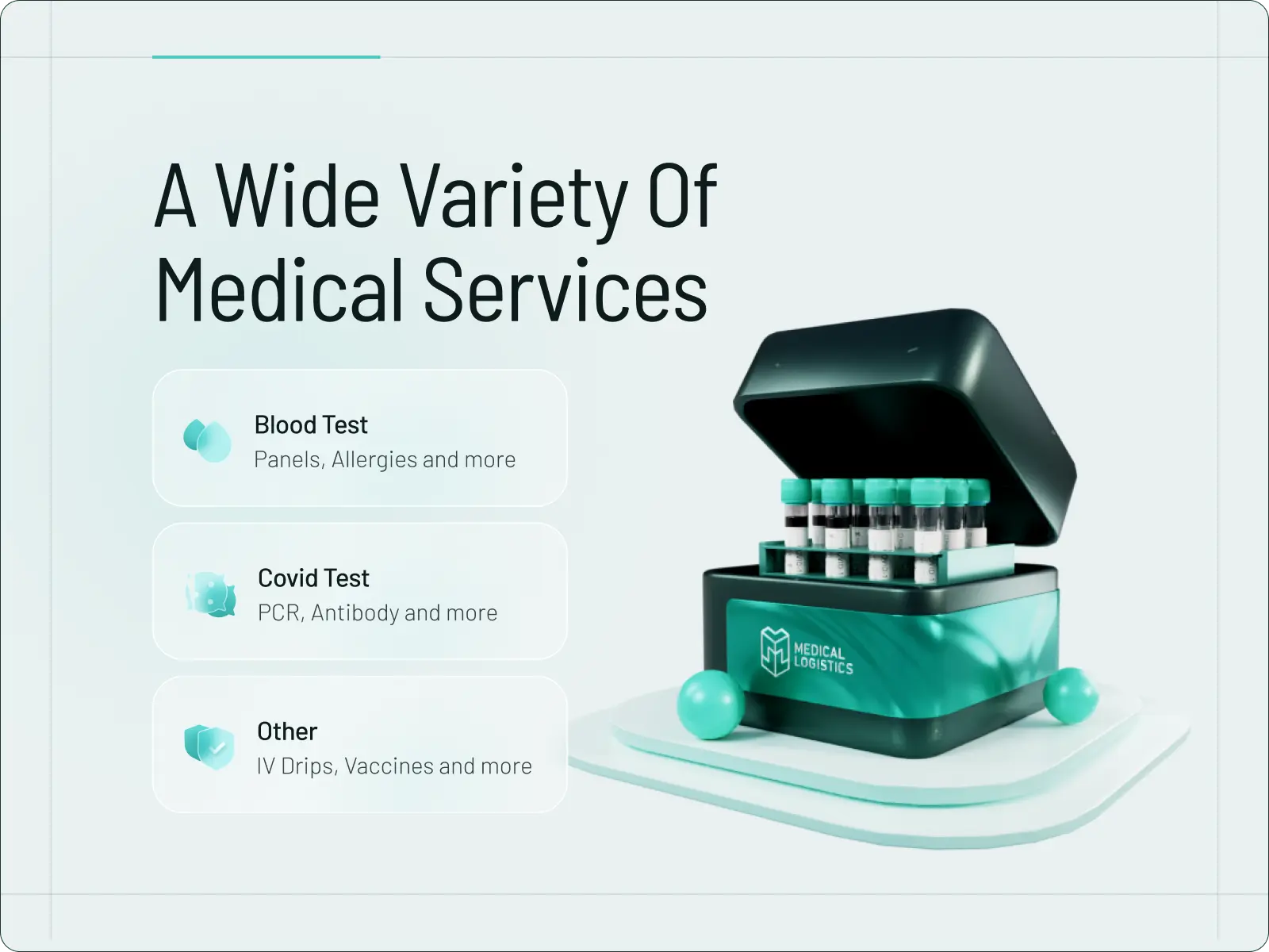
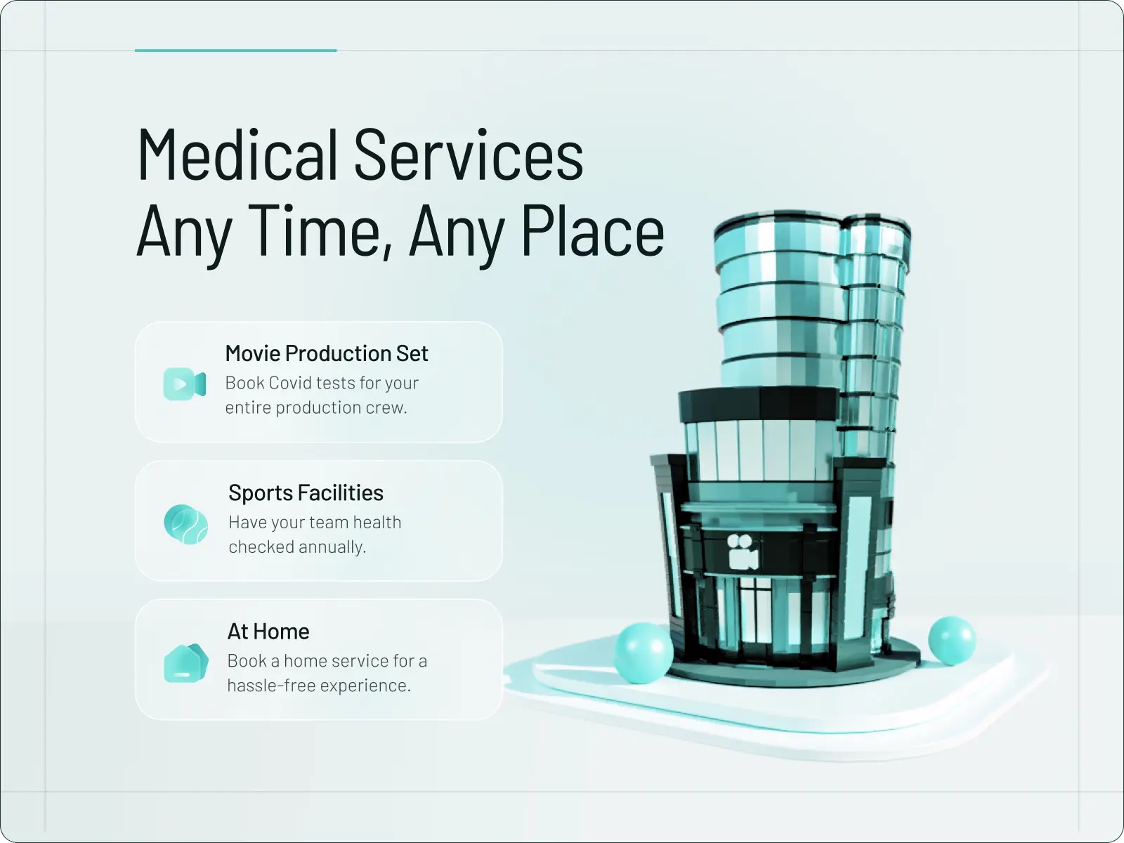
Medical Services Landing
The first of the landings that form part of the project delves into the medical services that are integral to Alex's company's offerings.
A significant portion of the project also involved crafting visuals that would embody the brand's character, serving both as an integral part of the website and, in the long term, as elements of marketing materials. On the medical landing page, we aimed to merge premium quality with a British ambience. Hence, the choice of a 3D model of a crown.
Another crucial section was the one detailing the offered services. It needed to be both clear and comprehensible, yet also captivating and demonstrating that the client would benefit from a premium service. To elevate this experience, we've prepared 3D models illustrating each service, adding a layer of engagement and clarity. This innovative approach not only captures attention but also vividly showcases the premium nature of the offerings, ensuring clients can visualize the exceptional value they're stepping into.
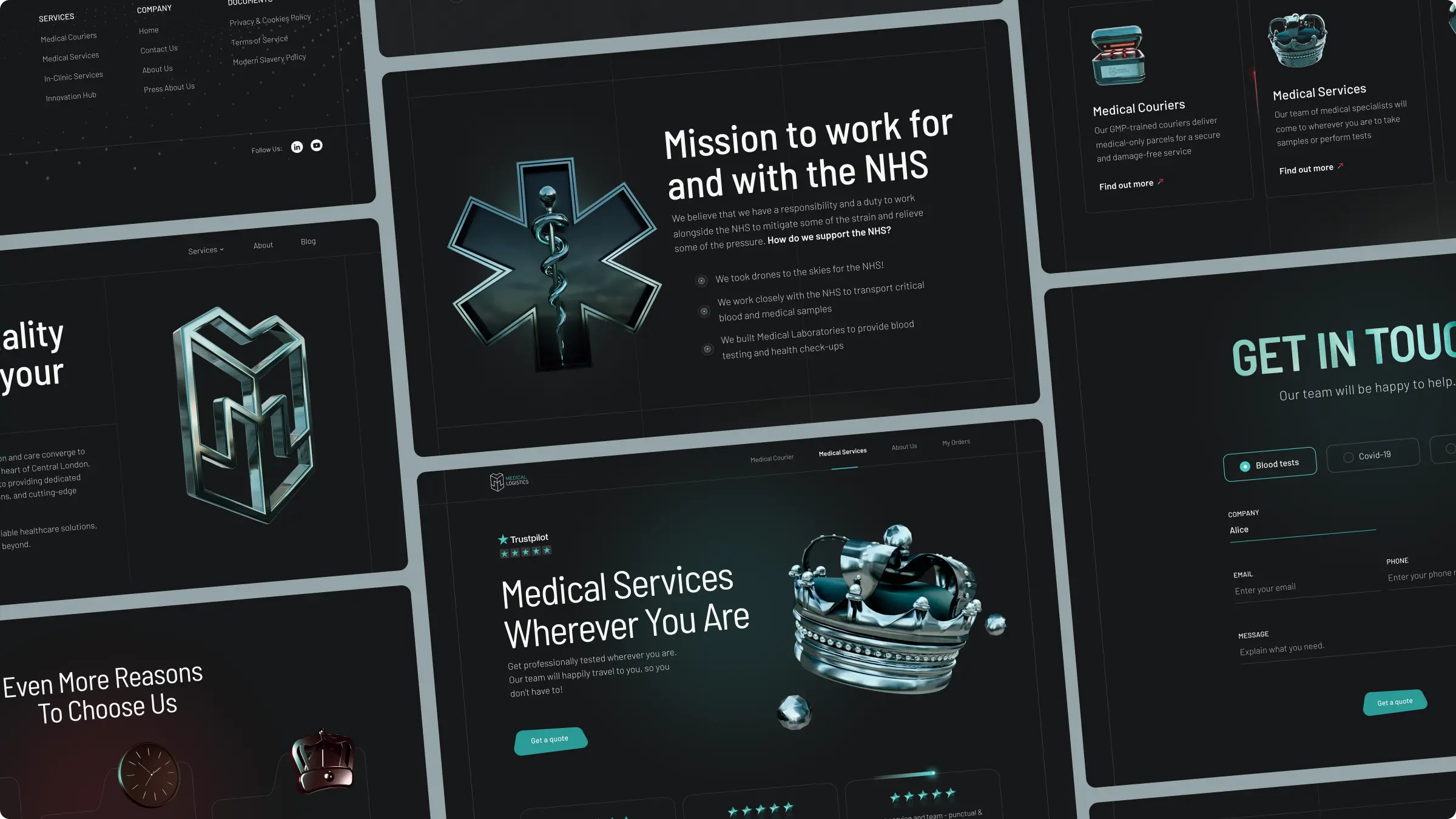
Couriers Landing
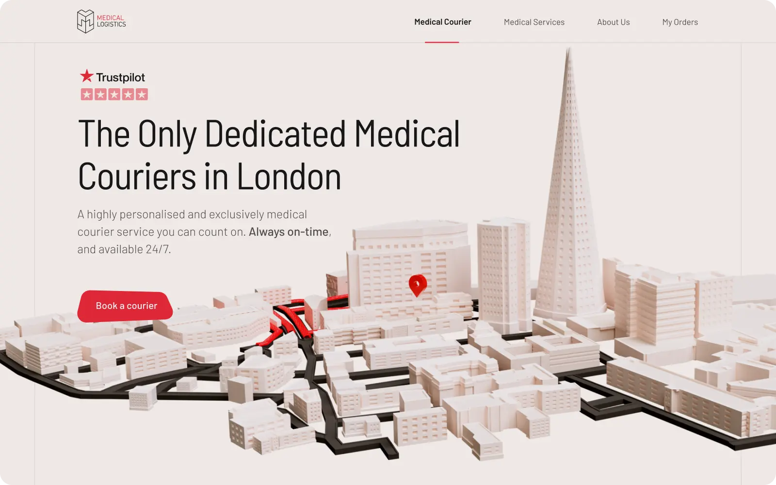
The next landing page focused on the services that not only were the first offered by the company but also have been provided the longest and form the foundation for the rest - courier services. However, it's crucial to note that these services are not standard courier offerings but are specialized in medical packages.
The hero section was designed to clearly highlight the company's values while simultaneously showcasing their primary operational area - hence, the depiction of London streets flooded with courier routes, in a red colour associated with the medical industry and blood.
What's interesting in this story? This animation was inspired by a map from the company's website, originally created by Alex years ago.
That's how the original map from the first website looked like:
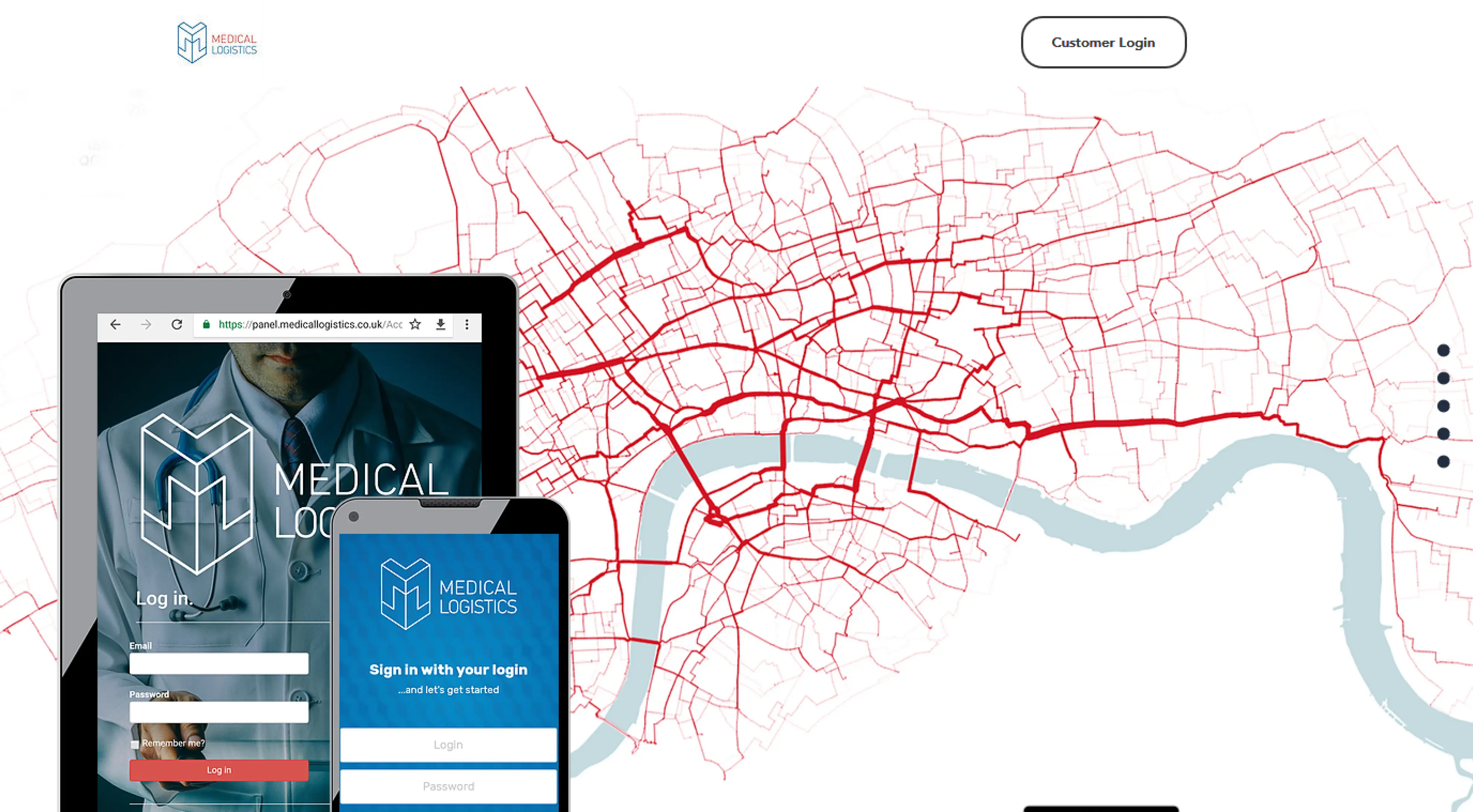
And inspired by the old map, the newly designed 3d version:
A key differentiator from other competing courier companies is precisely the specialization - a focus on packages of a medical nature, transporting only such items, and possessing the appropriate standards and certifications. This led to the idea of a separate section that visually illustrates what can be found inside the vehicles of Medical Logistics.
To ensnare the viewer's curiosity, we conjured up an additional animation. Aware that Medical Logistics prides itself on punctual and secure deliveries, we envisioned an animation of a scooter shedding packages along its journey. This imaginative depiction strikes a chord far more resonantly than the traditional assurances of "0 lost packages" and the like, painting a vivid picture of reliability and care in the viewer's mind.
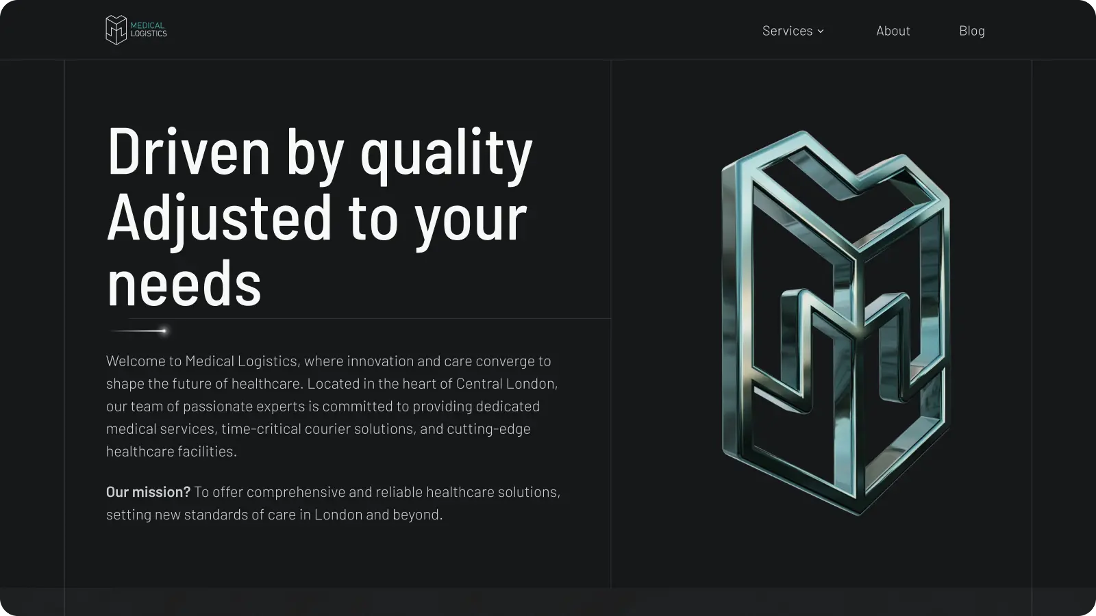
Main Landing
Medical Logistics, serves as both a comprehensive introduction and a vivid showcase of the company's scope, roots, and values. This page melds two distinct elements: the dynamic red of the courier service, symbolizing logistics and vitality, with the mint green of the medical service, denoting quality and customization.
The target audience for this landing was strategically chosen to first captivate investors and partners, placing direct clients as a secondary focus. This approach was designed to build a solid foundation of support and collaboration, ensuring the company's offerings were aligned with the needs and expectations of those who could propel its growth and expansion.
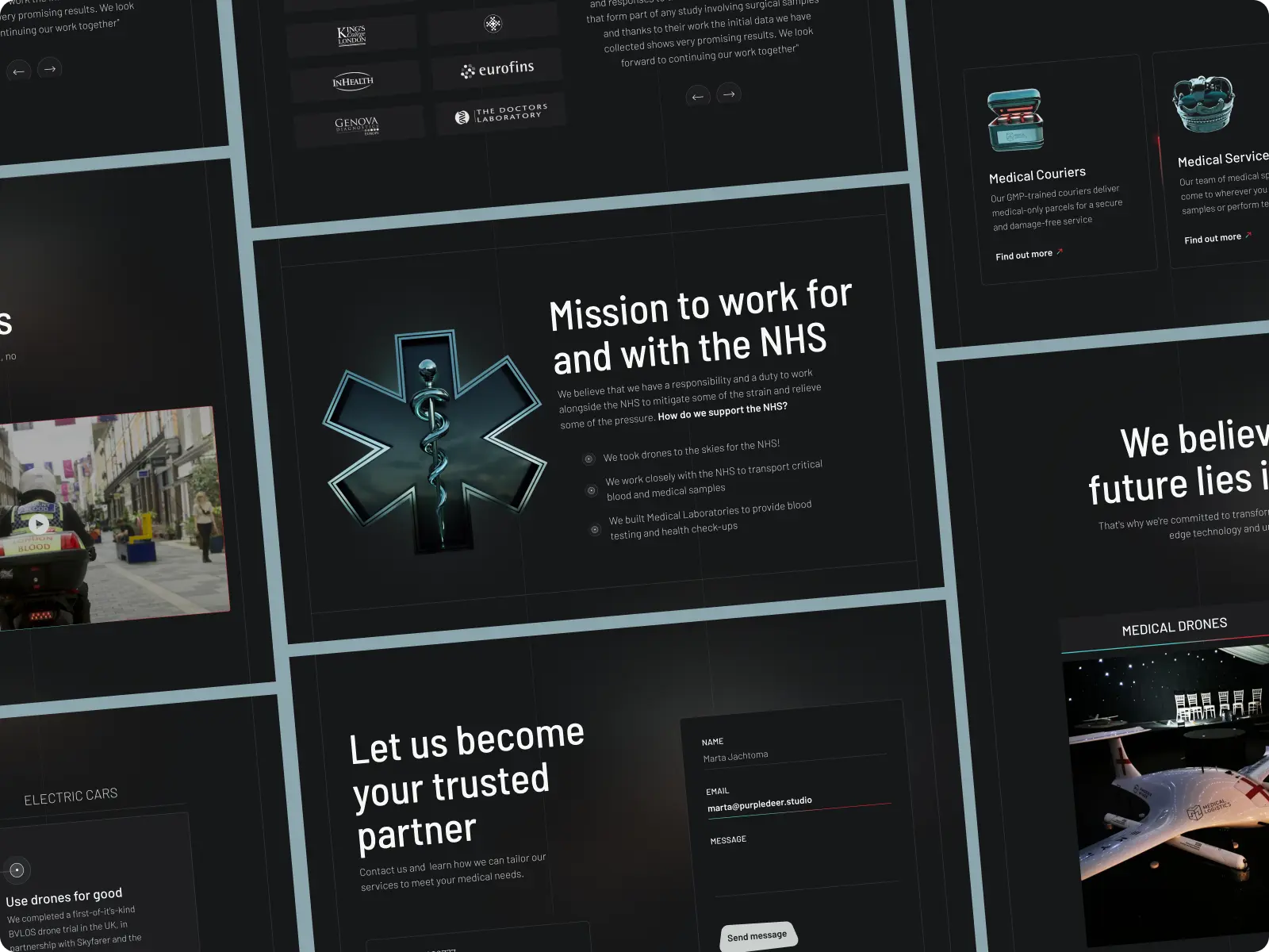
One of the key animations featured at the outset was a dynamic tile display showcasing the two core services: medical and courier. This animation was designed to clearly delineate yet simultaneously unify these distinct services under the umbrella of Medical Logistics. Through this visual representation, visitors were immediately introduced to the dual nature of the company's offerings, highlighting the seamless integration of high-speed logistics with specialized medical care. This engaging and informative animation served as a vivid introduction, setting the stage for a deeper exploration of how Medical Logistics uniquely combines these services to meet the needs of their clients.
How to tell the story of the company
"About us" section
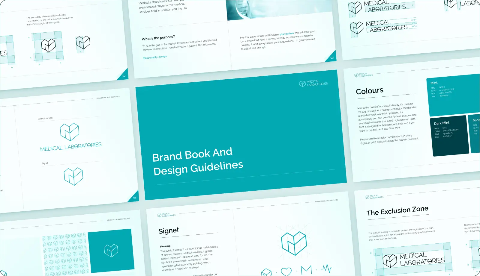
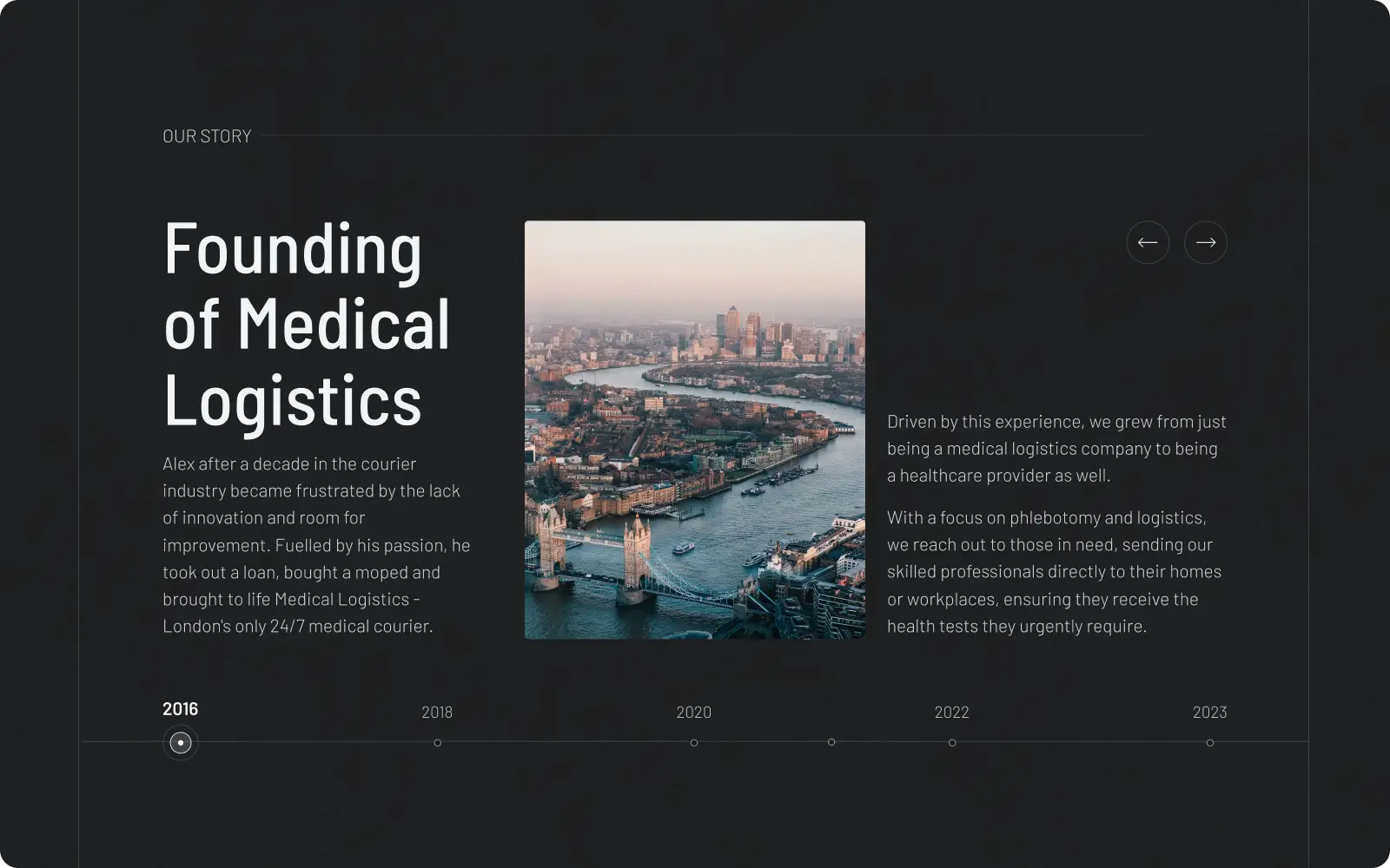
A distinct part of the project, developed after the initial set of landings was launched, was the expansive "About Us" story. In collaboration with an external copywriting agency, we conducted workshops and gathered essential information for inclusion and narration. The story was told in two parts: visually, through engaging graphics and animations, and textually, as an article on the blog. Purple Deer was responsible for designing and moderating the workshop and then preparing drafts and concepts.
This section didn't immediately appear as it does now. Initially, we started with a smaller version and a mini-section on the homepage, accompanied by a related article on the blog. Only over time, when it made business sense, did we design a full subpage with detailed information about the company, press articles, mission, history, etc. This phased approach allowed us to gradually build a comprehensive and compelling narrative that resonated with the audience, reflecting the evolving journey of the Medical Logistics brand.
"The whole process was very straightforward and easy to understand."
~Alex Landowski
Do you wish to collaboratively elevate your company's image to a new level? Reach out, and let's discover what will be the best first step on this journey.